My Role
Solo Product Designer
Design Efforts
Research, Data Analysis
Wireraming, Prototyping
Visual Design, QA Testing
Duration
4 Months
The Team
1 Solo Designer, 6 Engineers
1 Product Manager
DOmain
Enterprise SAAS
ENTERPRISE SAAS, Venture Capital Investment
Helping Investors analyze companies for better fund allocation
Company 360 is a newly integrated feature in Peak XV's venture capital investment tracking platform. It allows investing partners and analysts at Peak XV to study existing portfolio companies and analyze new ones, facilitating better fund allocation decisions .
Our users

Investor Analysts
Analysts focus on evaluating and analyzing investment opportunities, conducting due diligence, and supporting the investment team

Investor Partners
They hold more senior positions, overseeing the investment process, making strategic decisions, and managing the team's investment portfolio.

A rubrik based design language which is easy to read, analyze and also flexible enough to accommodate new data integration requests without having to be dependent on designers or digital transformations. A data friendly timeless design framework
Easily Add updates, read recent notes
User Scenario
Users need to add and consume updates about the companies so that relevant stakeholders can stay informed about the latest developments.
Solution
We integrated the Newsfeed feature by dividing the screen in a 60:40 ratio. Users can adjust the width using a resize toggle.
Additionally, a filter feature allows users to easily access historical data


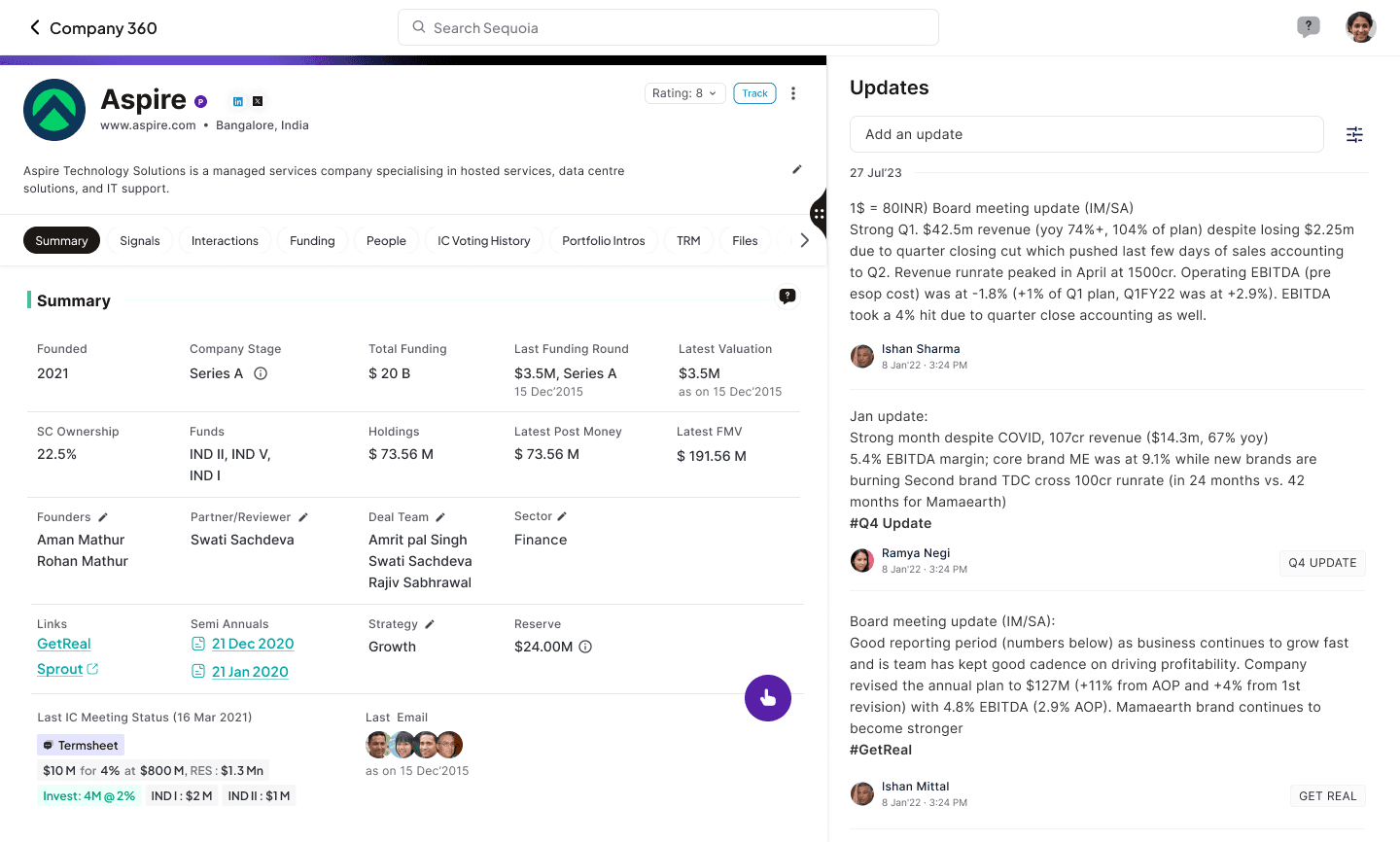
Summary - Fluid Grid based Data structuring
Scenario
Users want a summarized view of a company's key metrics that is simple, easy to consume, and flexible enough for future data integrations
Solution
Fluid Grid Based data organisation system to help the product scale seamlessly. This enables the UI to adapt and grow to varying amounts of content without manual adjustments or doing complete transformations

Graphical Data Visualisation
Simple graphical representation of data with sources for easy consumption
Fig:3 Signals

Tabular organisation
Layered presentation of Funding information with added filters giving optimum options to the users to analyze
Fig:3 Funding Details
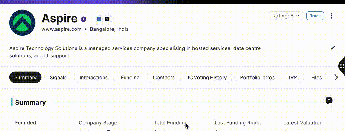
A Responsive scrollable Header
Solution
A dynamic header that changes shape on scroll providing full utilization of Real Estate for the users to review
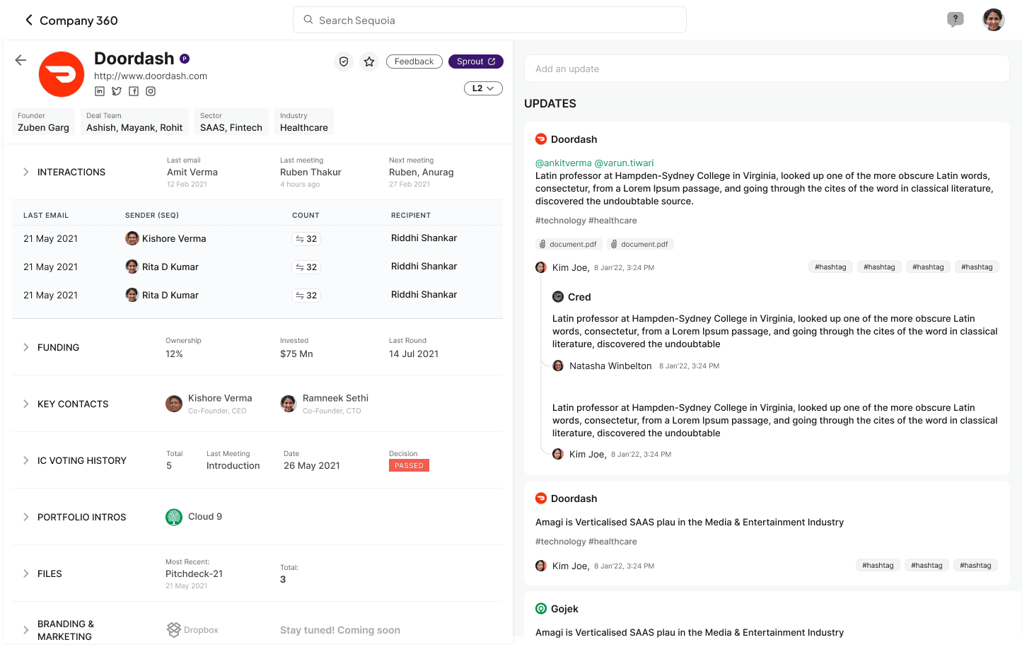
List of people Interacted with
User Scenario
When users assessed a new company using third-party applications, they found it very difficult to determine if anyone from Peak XV had previously contacted the company. For portfolio companies, they were unable to identify which individual had the most interactions with the company.
Solution
A tabular view which presents the user with a list of PeakXV pocs who interacted with a founder or a company

Designing with a Systems Approach
This was designed by factoring in other use-cases and by using a systems design approach. By engaging into complex dialogues and conversations with various stakeholders, We designed this dynamic 360 page that can easily accommodate other detail pages like People 360 or company 360.
We used a rubric based design principle which results in easy integration of upcoming features

Platform traffic went up to 3X after launch. Dependency on 3rd party apps reduced considerably
Post launch we recieved requests to replicate the same feature in the mobile app as well for quick access
Received requests from non investment teams like Human Resource, Marketing to integrate new features
This feature orchestrated the need to develop a set of new features for the investment team
Background
Peak XV had an internal investment tracking platform suffering from low user engagement due to heavy reliance on third-party applications for analysis.
Investors, analysts, and partners at Peak XV regularly interact with emerging founders and startups, analyze the financials of existing portfolio companies, and share updates across the team. Analysts often operate across multiple platforms to research and conduct due diligence on companies, leading to uncoordinated and redundant efforts. This fragmented approach highlighted the urgent need for improved centralized documentation and analysis capabilities within the platform to streamline workflows and enhance overall efficiency.
BUSINESS Challenge
How might we increase usability & help analysts, investors and partners at Peak XV assess and analyze companies seamlessly through their centralised investment platform
OVERVIEW OF THE EXPERIENCE TRANSFORMATION
Understanding the CORE Problem
I kicked off the project with a comprehensive analysis of the current process. I individually spoke with 10 users to assess their daily activities and how they scout and analyze companies. I aimed to understand the challenges they face, the metrics they need, and how we can add value to their daily processes through an interface
KEY SIGNALS
“You see, there’s a lot of manual work that we have to do. From jumping multiple third party apps, to cleaning and adding right data”
-Juinior Analyst
“It is not possible to get all the data from one source. The dependency on the platforms is imperative. If we are studying a company , it is important for us to know the source”
-Partner
“Sometimes, for our portfolio companies a lot of the data exists in our internal tool and excels. While seeing 3rd party apps, we don’t get that contextual data differentiating between a portfolio company and a new company”
-Juinior Analyst
“When we scout any company or a stealth founder we are unaware if any other member from Peak has done any work on them”
-Principal Analyst
Redundant Efforts
Consume Data Fast
Scattered Repositories
Disjointed Experiences
Lack of Transparency

Studying The Third party apps
I studied the third party applications & also benchmarked them in order to assess
What is the sequence of steps a user has to follow during company analysis?
What is the data organisation architecture in each of these platforms?
Which of these source has more data and what is the visual approach
Challenge
One of the signals we had received from the leadership, which also echoed during the workshops is the need to integrate the feature along with the company profile so that the users can seamlessly analyse companies with ease. These notes include updates like financial health, new discoveries, Meetings etc.
The newsfeed is a twitter like internal feed that internal investors, analysts and different teams inside PeakXV use to update everyone in the organisation regarding different companies, founders, new investments etc.
The existing newsfeed with features to be integrated

Quick Filters
Option to add new Notes
Notes and updates added by different users
WHAT DIDN'T WORK OUT
Collapsible Sections
Collapsible section with some highlights were not data friendly as with new data it gets difficult to manage
No option to change the size of the window
The design did not accommodate user flexibility, as it did not allow users to adjust the size of the left and right panels, limiting their ability to customize the layout to suit their preferences
No option to fliter
There is no option to filter historic updates if the users wanted to view
Collapsible Sections
Collapsible sections also added additional clicks which reduces system affordance
Segregated Content
The disstribution of content did not feel logical
Learnings
Working with Peak XV was one of the significant experiences in my career. It pushed me to learn the intricacies of the startup ecosystem and also enabled me with all the information about how a Venture Capital System works. It also exposed me to learn how selective user feedback lead to solutions that don't meet the needs of the broader user population. Trying to accommodate every user request, even contradictory ones, can make the product unfocused and difficult to use
Identifying and prioritizing Users need
I did a quick workshop with some of our users who came with deep understanding of the background and worked with them to map out the features we need to focus on. This gave us diverse & comprehensive perspectives as we charted out a plan for MVP.
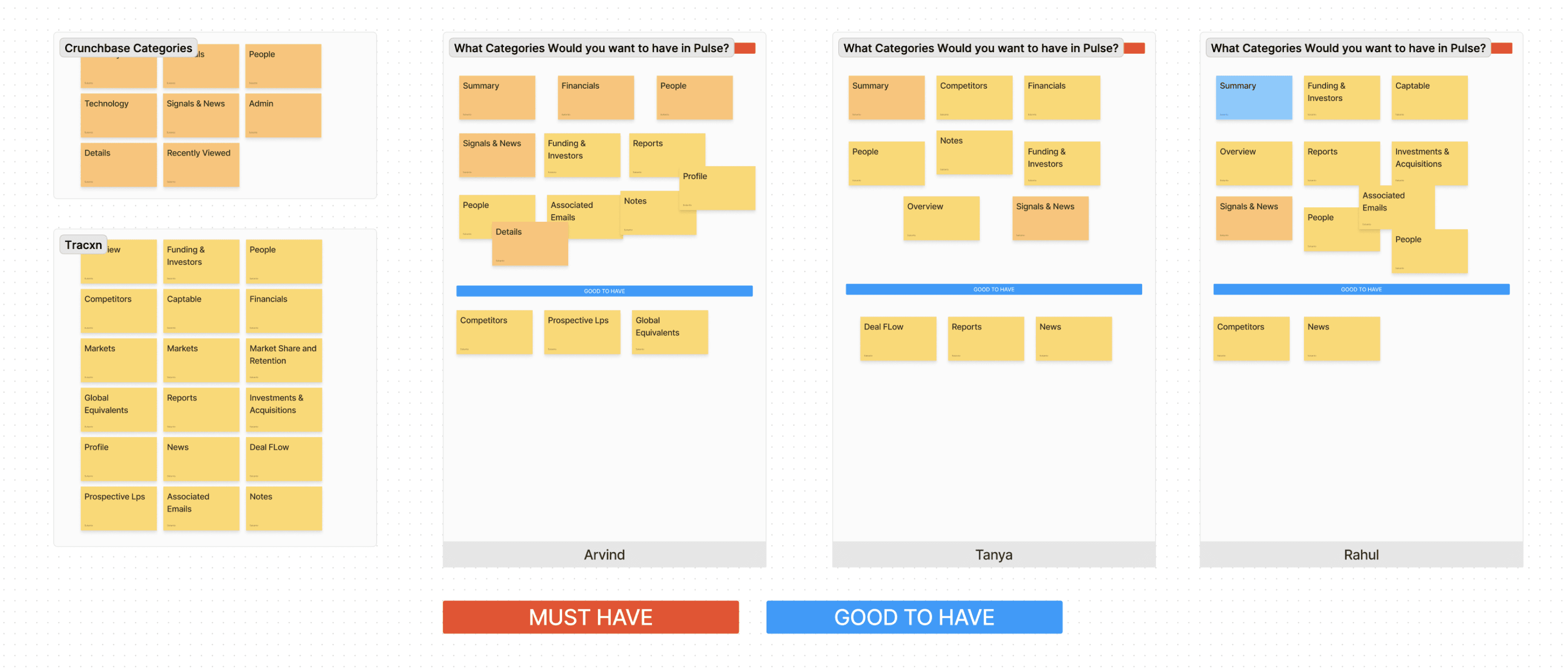
Explorations
More Insights
How would this design work for people details and investor details?
-Partner investor
If we want to introduce a new metric, do we have to redesign?
-Engineering Manager
If I add a note on newsfeed, will this get added here?
-Analyst
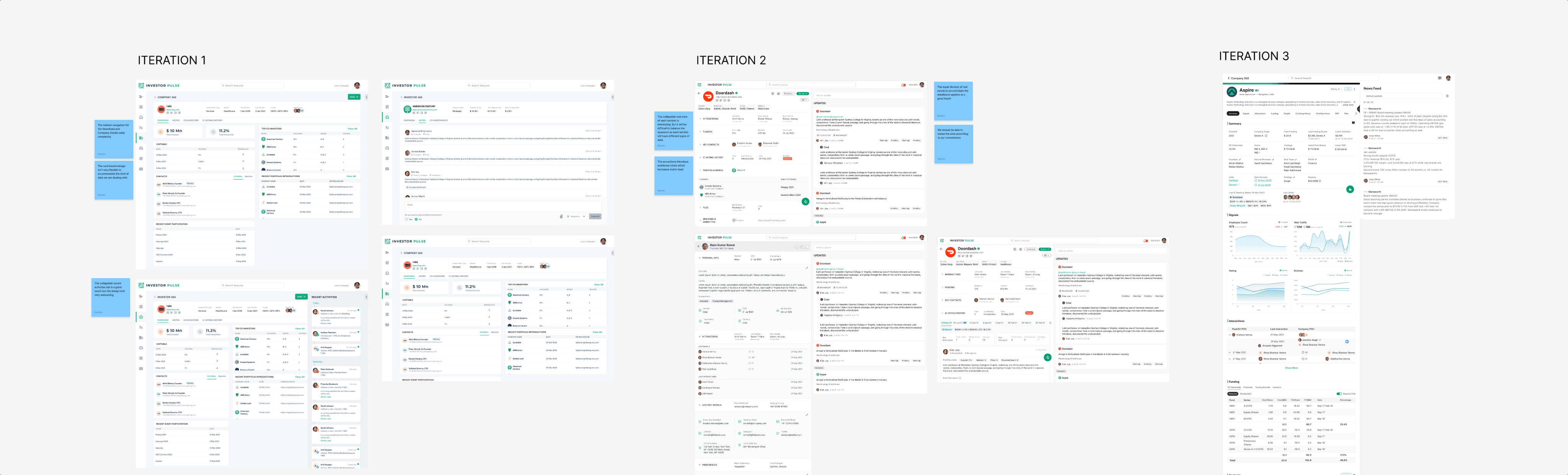
Explore >Ideate>Test>Fail> Reiterate
We tested multiple variations of the MVP with users and stakeholders using a user-centered design approach, which helped us move quickly with context.
One successful aspect was visually presenting the designs to explore users' diverse perspectives and reactions. This process provided a deeper understanding of the stakeholders and informed the evolution of our MVP. It also encouraged us to think beyond a single design, adopting a holistic systems thinking approach.

PROCESS