Design System / Digital publishing
Managing a Multi-Brand
Design system
Verso: Verso is Condenast’s multi-brand Design System aimed to support Conde Nast Brands. It enables us to extend everything we build to all brand markets around the geographies


My Role
Product Designer Design Systems
Responsibilities
Improve design governance
Be an advocate and provide assistance
Migrate Legacy brands
Develop new shared components
Business Goals
Migrate Legacy brands into verso
The Team
3 Designers, 1 Design Lead
2 Design System Engineers
10+ Engineers
Brands Handled
7 +
HOW IT WORKS?
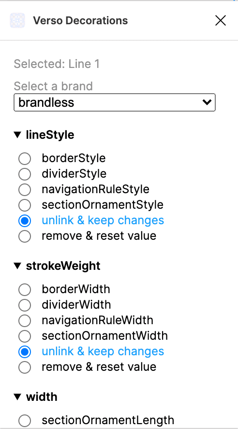
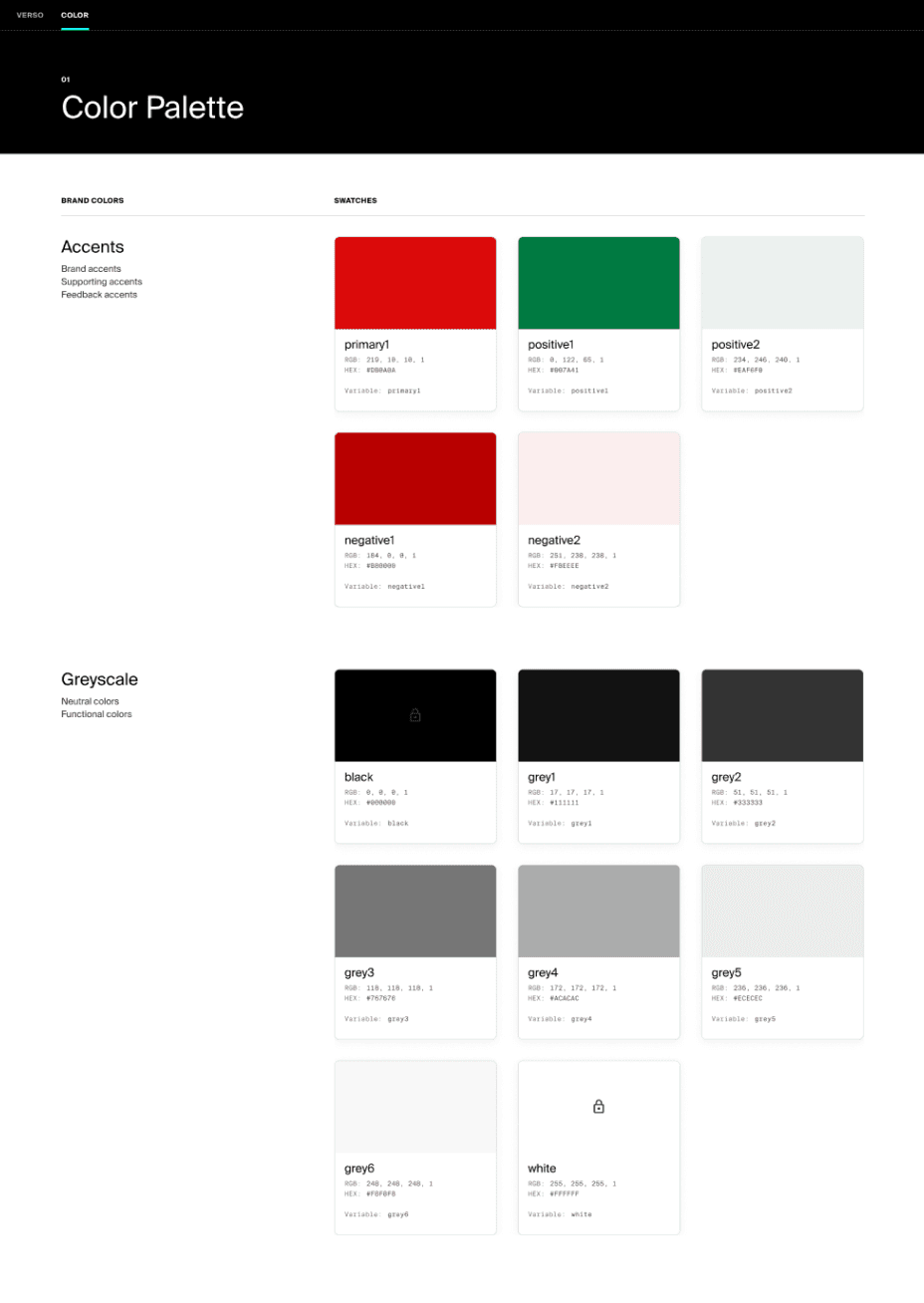
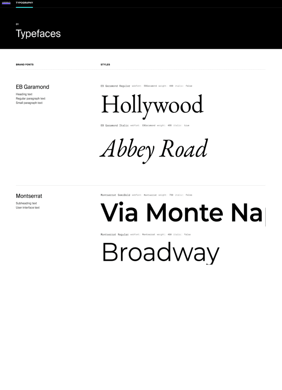
Verso is organised using atomic design principles which facilitates logical organisation of components ensuring maximum re-use and consistency . Due to the presence of multiple brands we also had to create unique individual brand identities using Color and Typography tokens.
Overview
Condé Nast owns 20+ of the most-renowned media brands in the world with an audience of 120+ million across 32 geographies. Most of the brands are into media and publishing industry who essentially publish content but had disconnected platforms with poor user experience.
To increase the speed of product development and improving the overall user experience across the network of web and mobile sites the brand has created a Multi-Brand Design System called Verso.

Component Library
Multiple variations of components allow for many different outcomes, such as alignment and ordering of elements
Button
Brand Identity
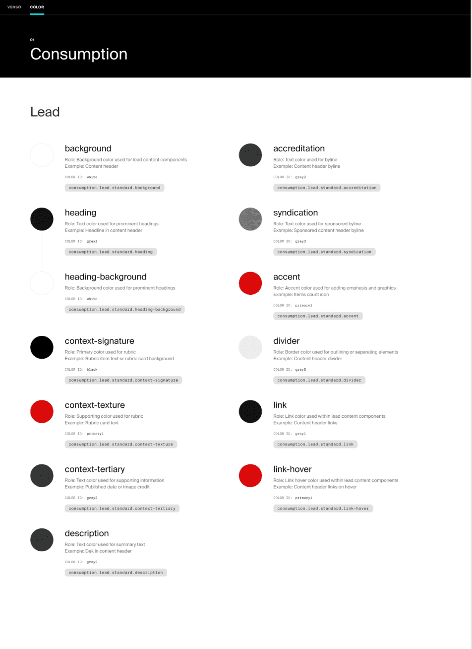
A system of design tokens that define the visual attributes of brands through type and colour. It helps to provide individuality to each brand
Aa
Plugins
In-house developed plugins aimed to provide the color,decoration and typography styles on the components and templates.
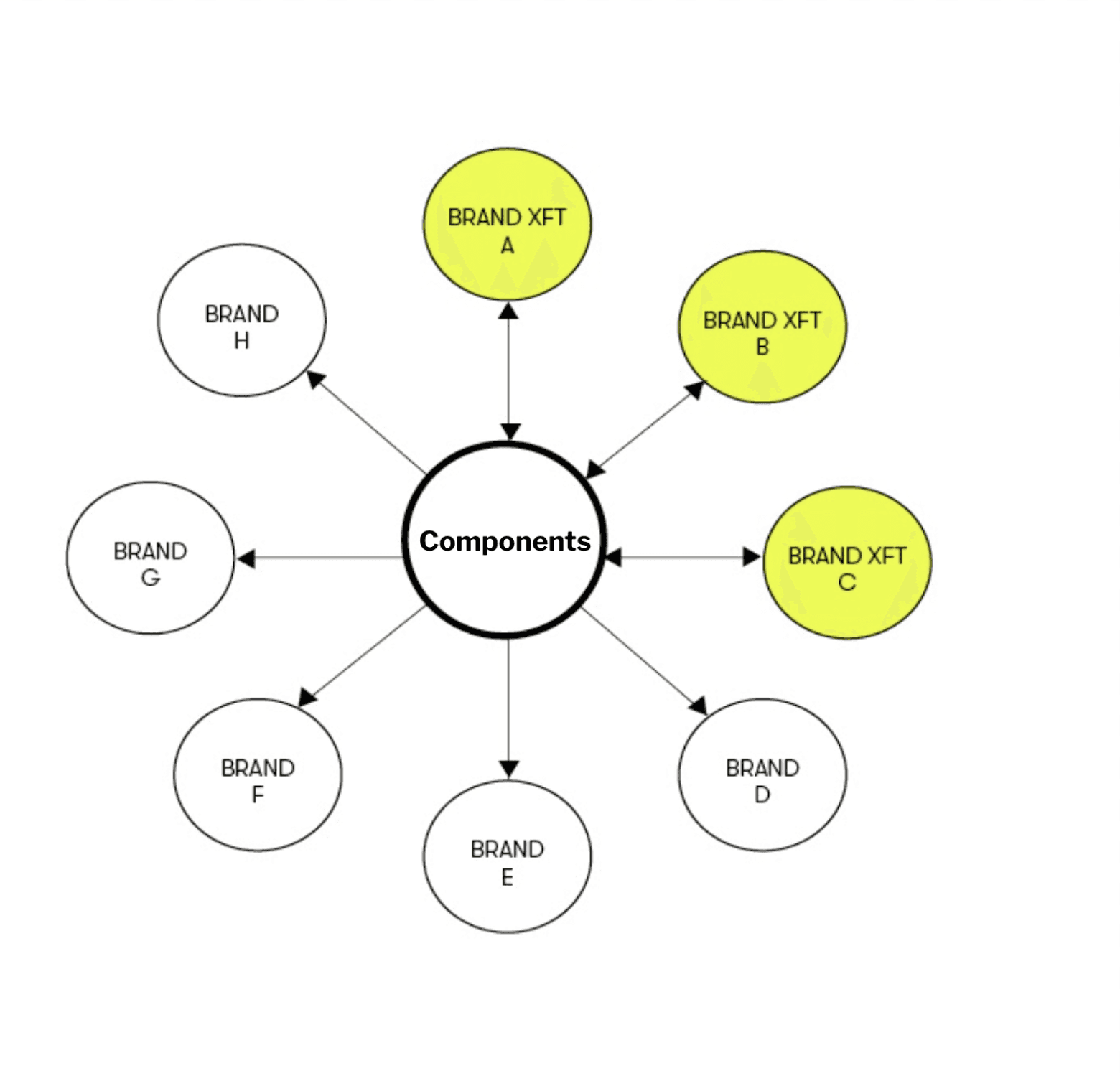
FEDERATED APPROACH, Centralised Application
Verso design system works with a systems thinking approach where one design component can suffice requirements of 20+ unique brands using permutations and combinations of design elements and applying our sofisticated Brand color and type tokens
Brand Agnostic Components
PLUGINS
Our engineers have designed cusomised plugins that help us to work faster and smarter. These plugins bind the design system together reducing the manual work


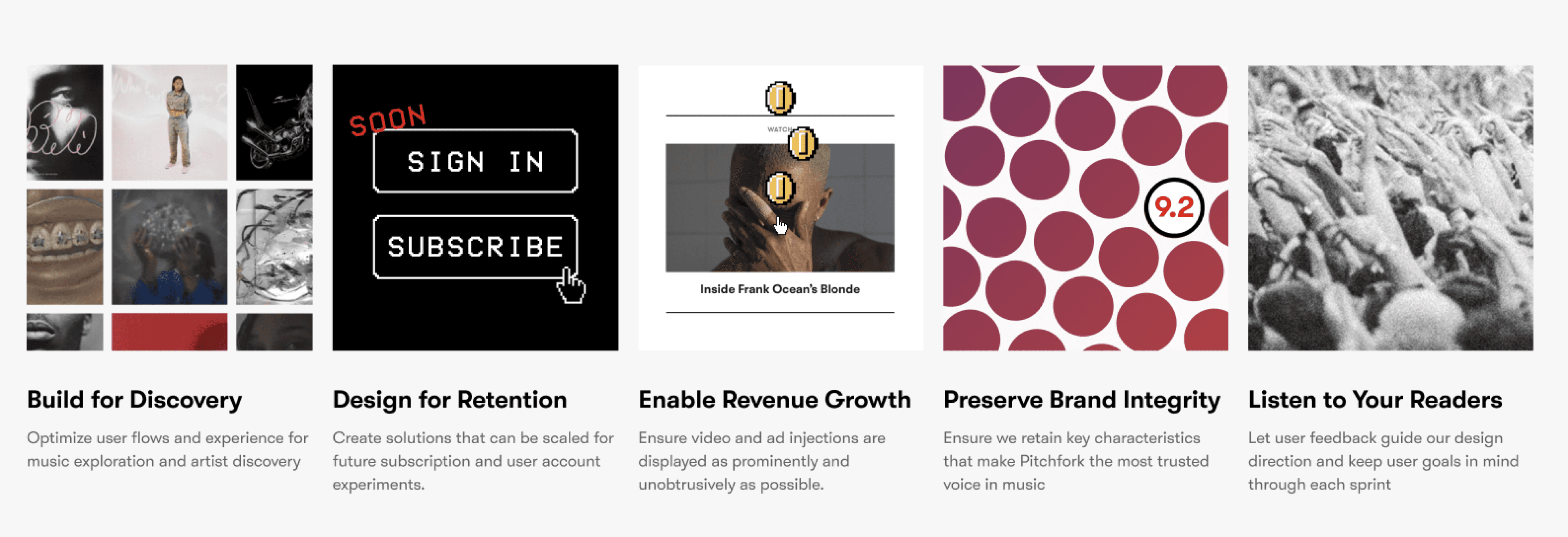
Redesign of Pitchfork Homepage
Pitchfork is a leading American online music publication best known for its daily output of music reviews but also regularly reviews reissues and box sets. It is one of the remaining brands that has the majority of its traffic (73%) still hosted on its legacy tech stack.
I was tasked with migrating the brand into the Verso Design System stack, utilizing available components optimally and creating new components as needed.


Business Goals

Overview of the Redesign


Latest News Mobile
Latest Videos Web
Featured Content
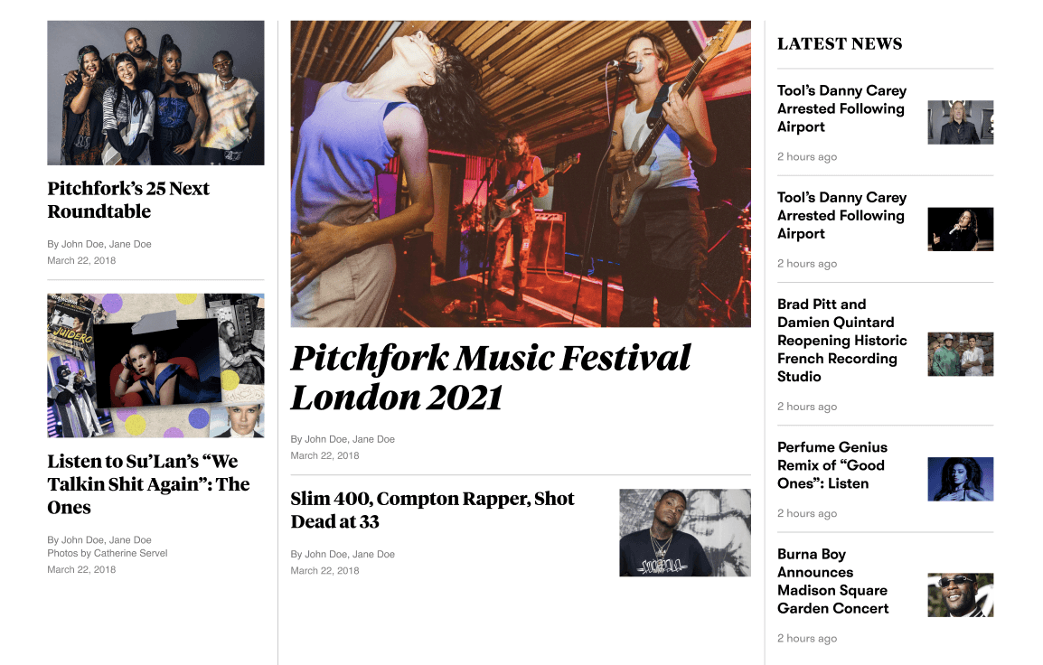
Landing Gallery
DESIGN PROCESS
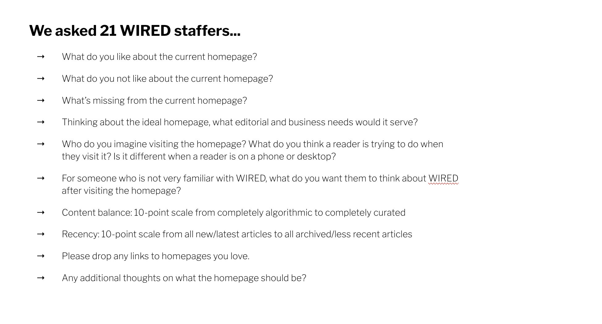
I asked the Staff of the Editorial Team
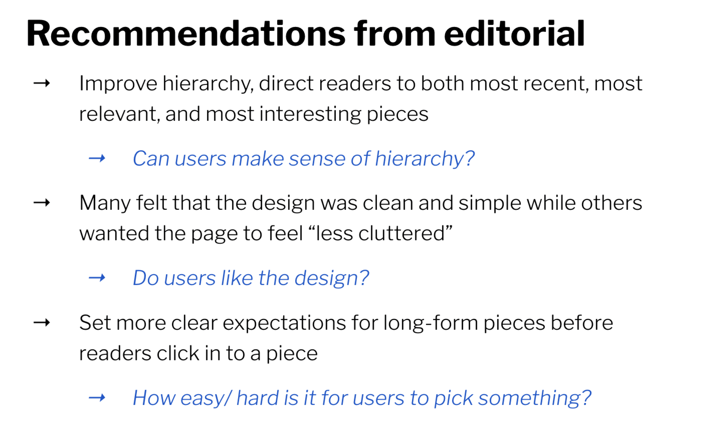
Recommendations
Mapping
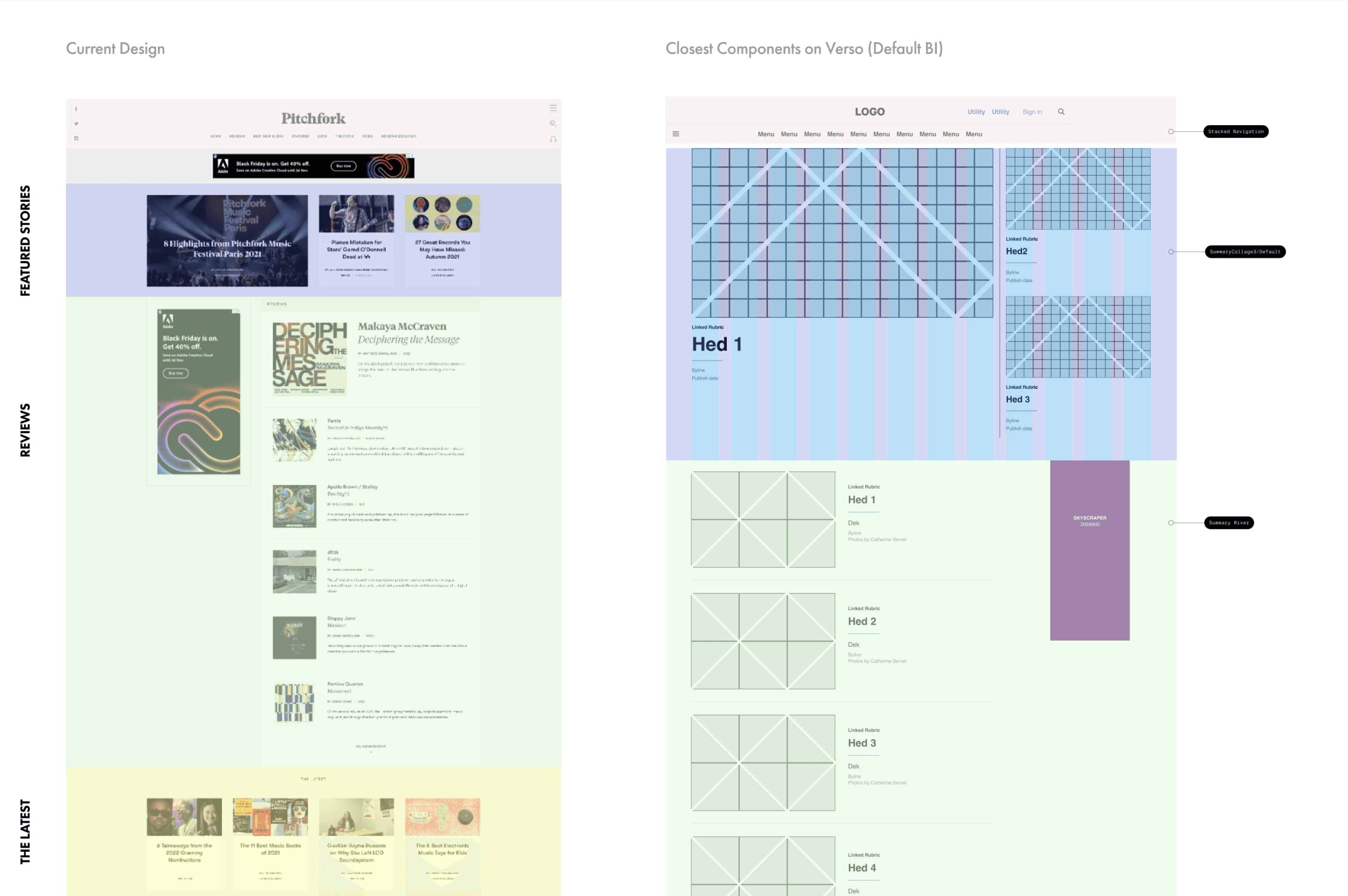
Audit Legacy Website
Map legacy design & find closest available components
Identify, missing component , create layout explorations
Tokenise the design and create documentation for handoff
Design QA
DESIGN EVOLUTION and explorations
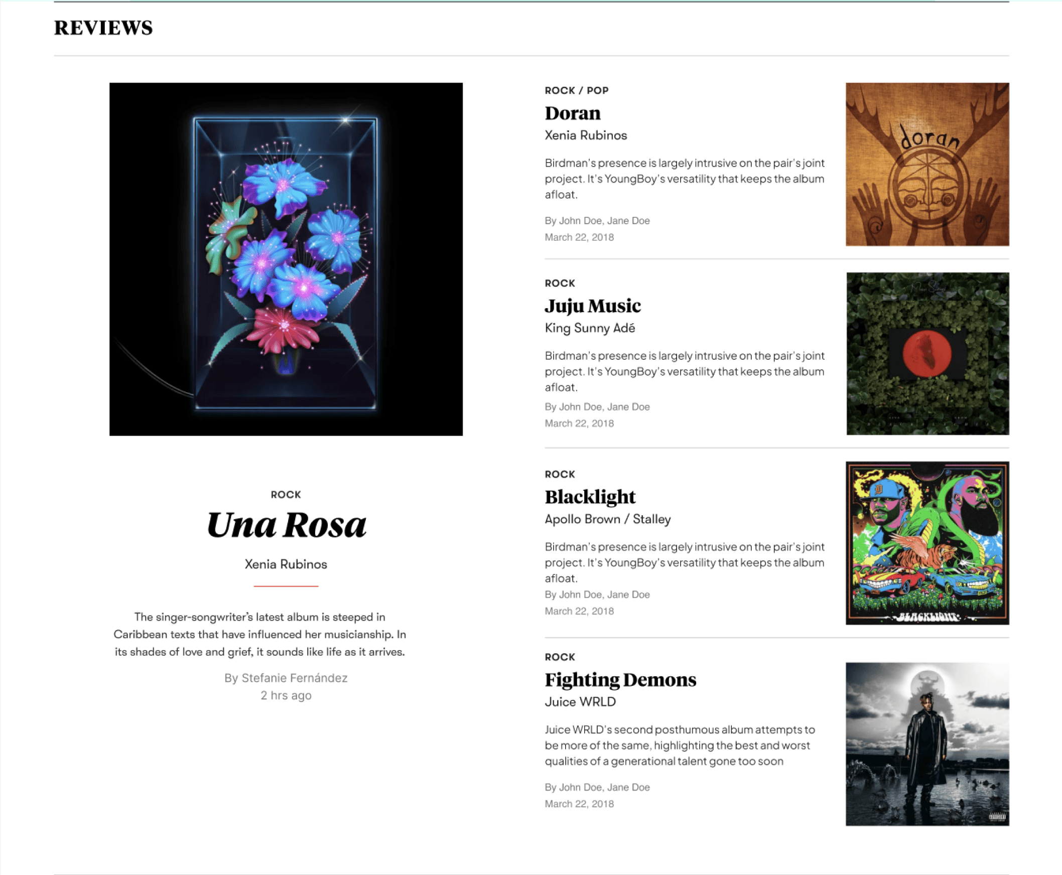
While I was able to design the entire website using our existing components stack , One section which needed some work was Reviews. This feature needed additional variations to make it stand out as it was one of the most important feature in the product.

Designing Components
from scratch
If one looks at the components, one would notice the components are made up of multiple sub-components (molecules and atoms).
To make this, new component, I designed new subcomponents and integrated them into the structure. I also identified the existing components which could absorb this into their family.
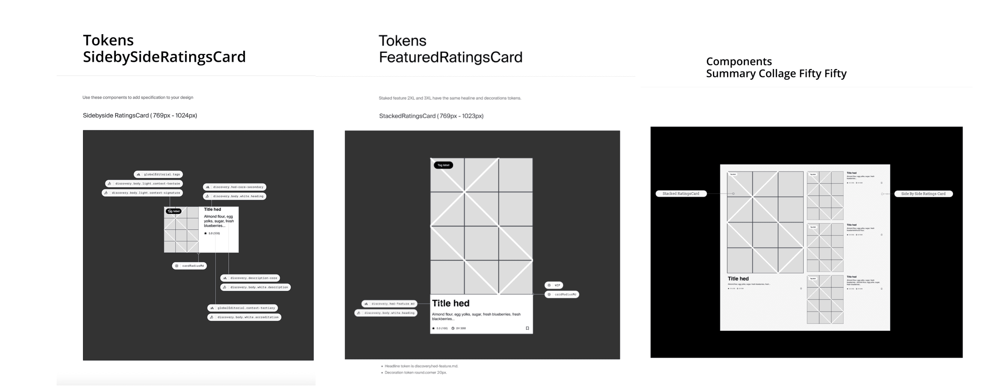
ANATOMY OF THE COMPONENT
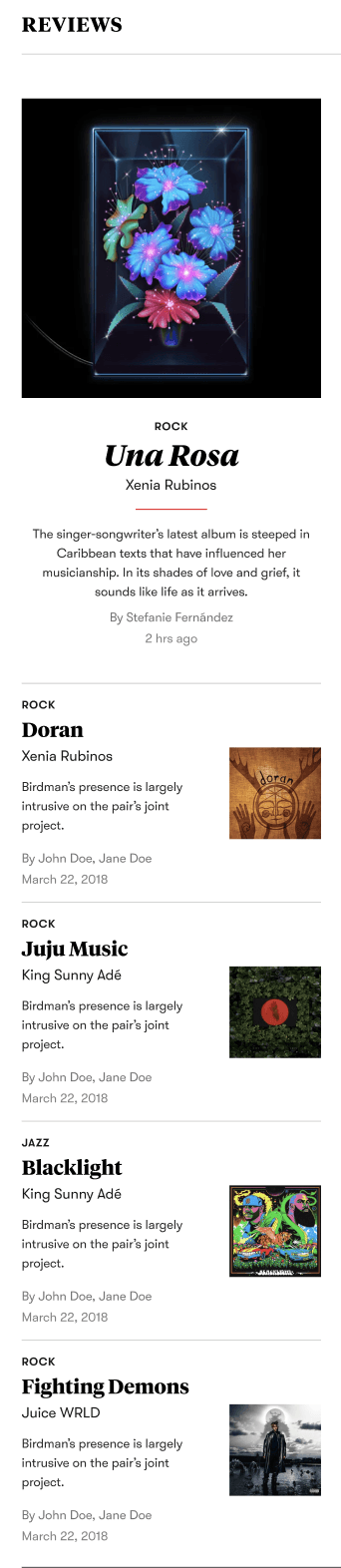
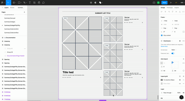
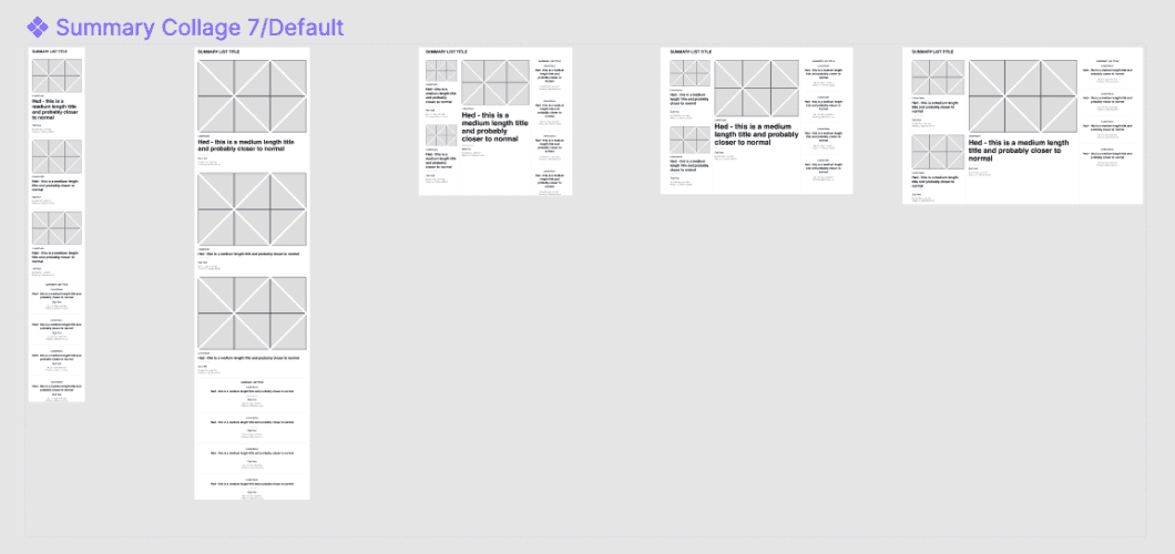
Breakpoints and Variations


Creating Brand Identity
The brand identity is what makes each brand on Verso unique and engaging. Each brand within the Verso Design System has a distinctive BI file that stores its specific styling information.
While migrating a brand, I also created brand identities integrating it with the design system ensuring that each brand maintains its individuality while adhering to a cohesive overall design framework. This approach allows for both consistency and customization, providing a flexible yet unified experience across different brands.
SYSTEMISED DOCUMENTATION
Every detail of the system's design was documented in Figma for easy team access and later developed into a website. The implementation and development of the system were tracked via GitHub and Storybook, where similar documentation was available for the development team

REFLECTIONS AND IMPACT
Condé Nast, a digital publishing brand with a wide-reaching team across multiple geographies, manages over 20 brands. While working on their Design System, I learned the importance of reusing and integrating existing components to design new features. This is where a systems thinking approach and thorough documentation play a crucial role. It was my first experience being part of a large Design Systems Team, and I came to understand the significance of shared design systems in an organization. With proper documentation, communication channels, and design governance, we were able to perform brand migrations swiftly and reduce redundancy, keeping the number of components manageable