My Role
Product Designer
Design Efforts
Research, Data Analysis
Wireraming, Prototyping
Visual Design, QA Testing
Duration
6 Months
The Team
2 Designers, 13 Engineers
2 Product Manager
DOmain
Enterprise SAAS
Outcome
Saved users a lot of time
and effort
ENTERPRISE SAAS, Venture Capital Investment
Helping investors analyze startups for better fund allocation
Investor Pulse is an all in one enterprise application which Investors and Analysts at PeakXV can use to assess startups, document various metrics and automate the process flow of venture capital investment by reducing dependency on other tools.
I owned the web and mobile experiences for PeakXV’s Investment management platform which was called ‘Pulse’. I had the wonderful opportunity to ideate from the very inception of this platform, working & collaborating with various stakeholders like Investor Analysts, Partners, Product managers, engineers and more. I helped define the information architecture, set up the design library (with a hope that it would become a design system one day 😌). This case study is just one of the many features I had worked on while I was working with the organisation.

Impact
Traffic Boost
Platform traffic went up to 3X after launch. Dependency on 3rd party apps reduced considerably
🙌🏼
Mobile App Extension
Post launch we recieved requests to develop the mobile version for quick access
🥳
New Features
This feature orchestrated the need to develop a set of new features for the investment team like tracking, and deal pipeline
🎊
Background
Peak XV had an internal investment tracking platform suffering from low user engagement due to heavy reliance on third-party applications for analysis.
Investors, analysts, and partners at Peak XV regularly interact with emerging founders and startups, analyze the financials of existing portfolio companies, and share updates across the team. Analysts often operate across multiple platforms to research and conduct due diligence on companies, leading to uncoordinated and redundant efforts. This fragmented approach highlighted the urgent need for improved centralized documentation and analysis capabilities within the platform to streamline workflows and enhance overall efficiency.
Business Challenge
HMW create a centralized system for analysts, investors and partners to research, analyze, and collaborate on emerging companies and own portfolio companies by unifying 3rd party platforms?
Note: to see the process, please scrolldown towards the bottom
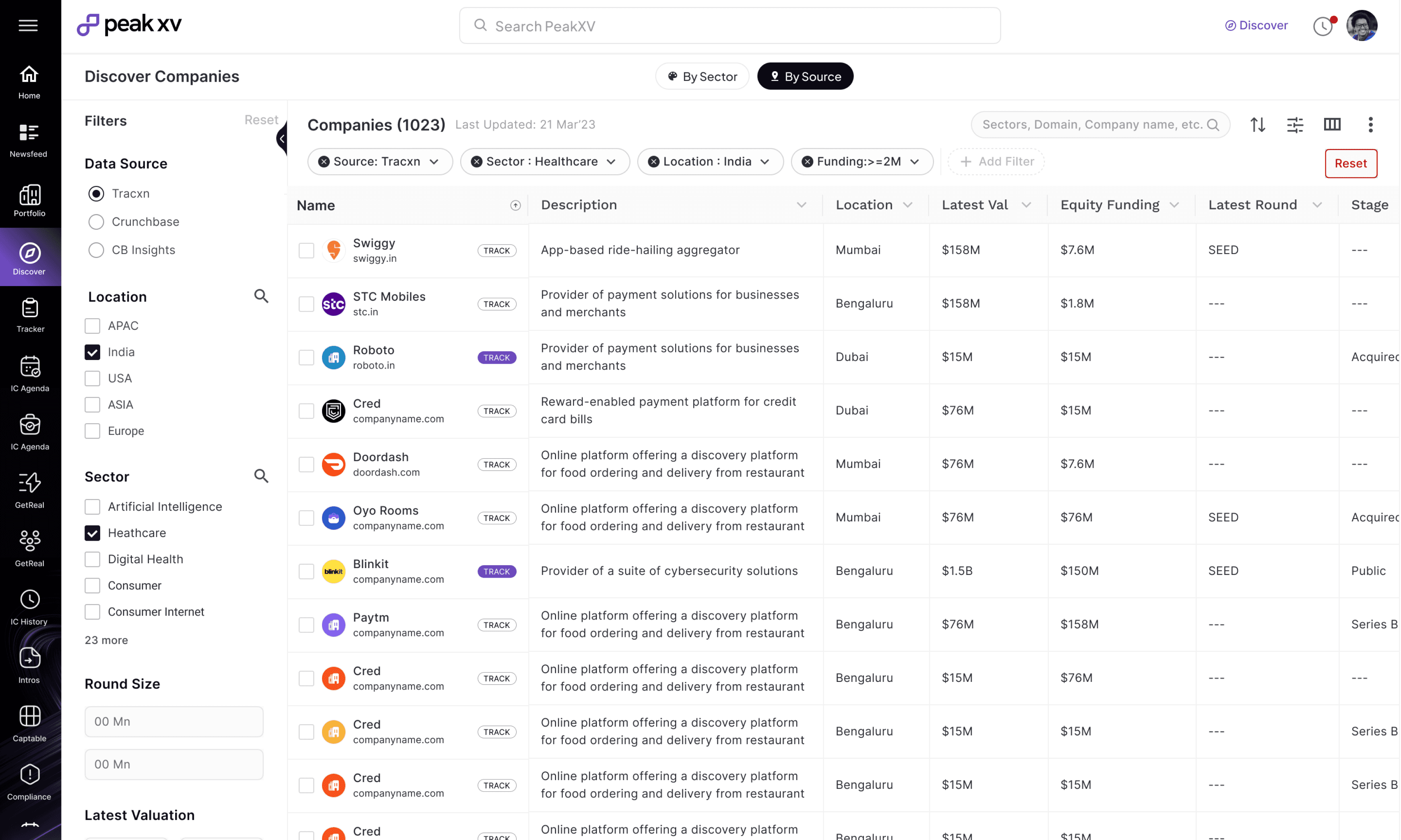
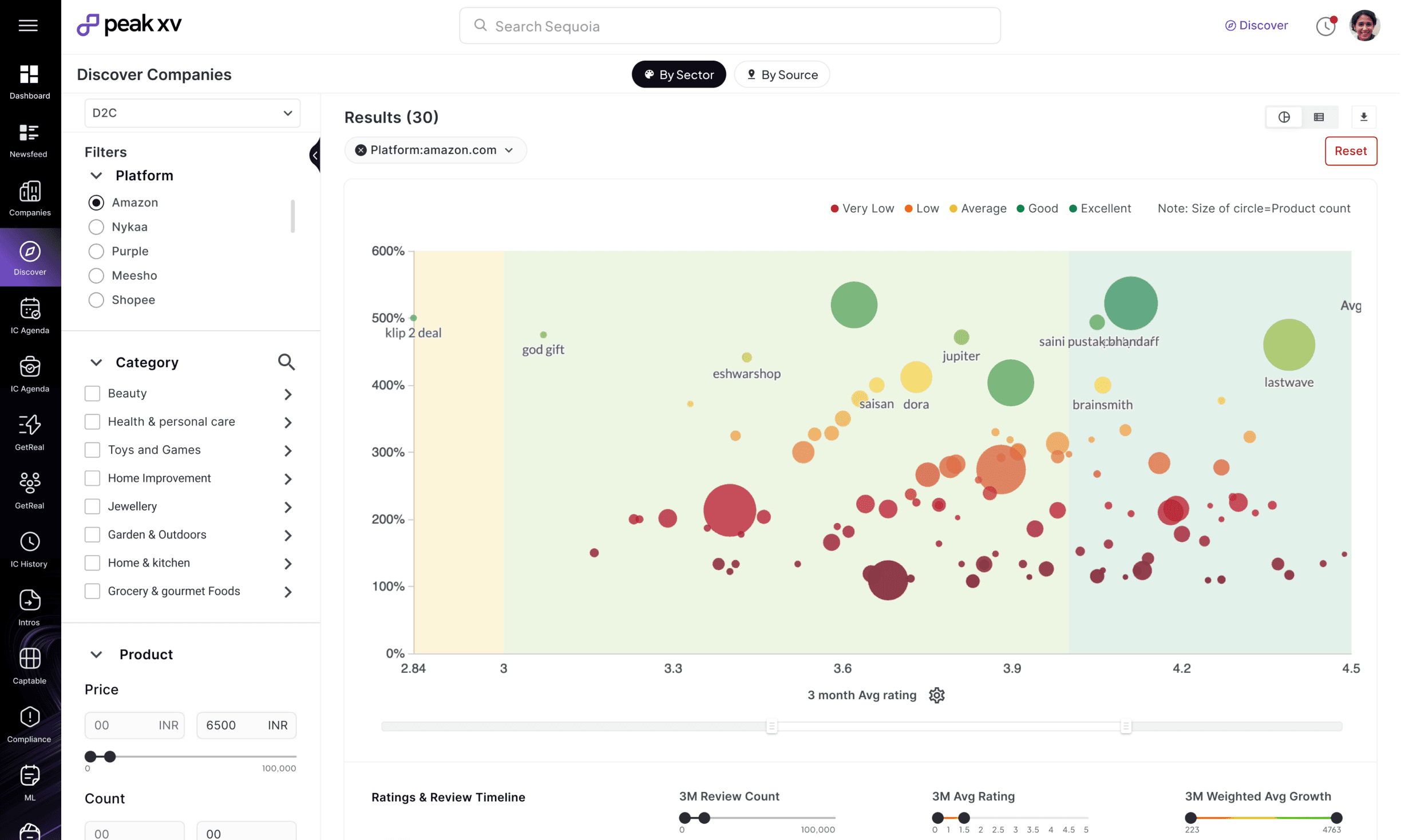
Discover
Explore investment worthy companies with high traction & growth using source based simple filters, data visualization tools.
2
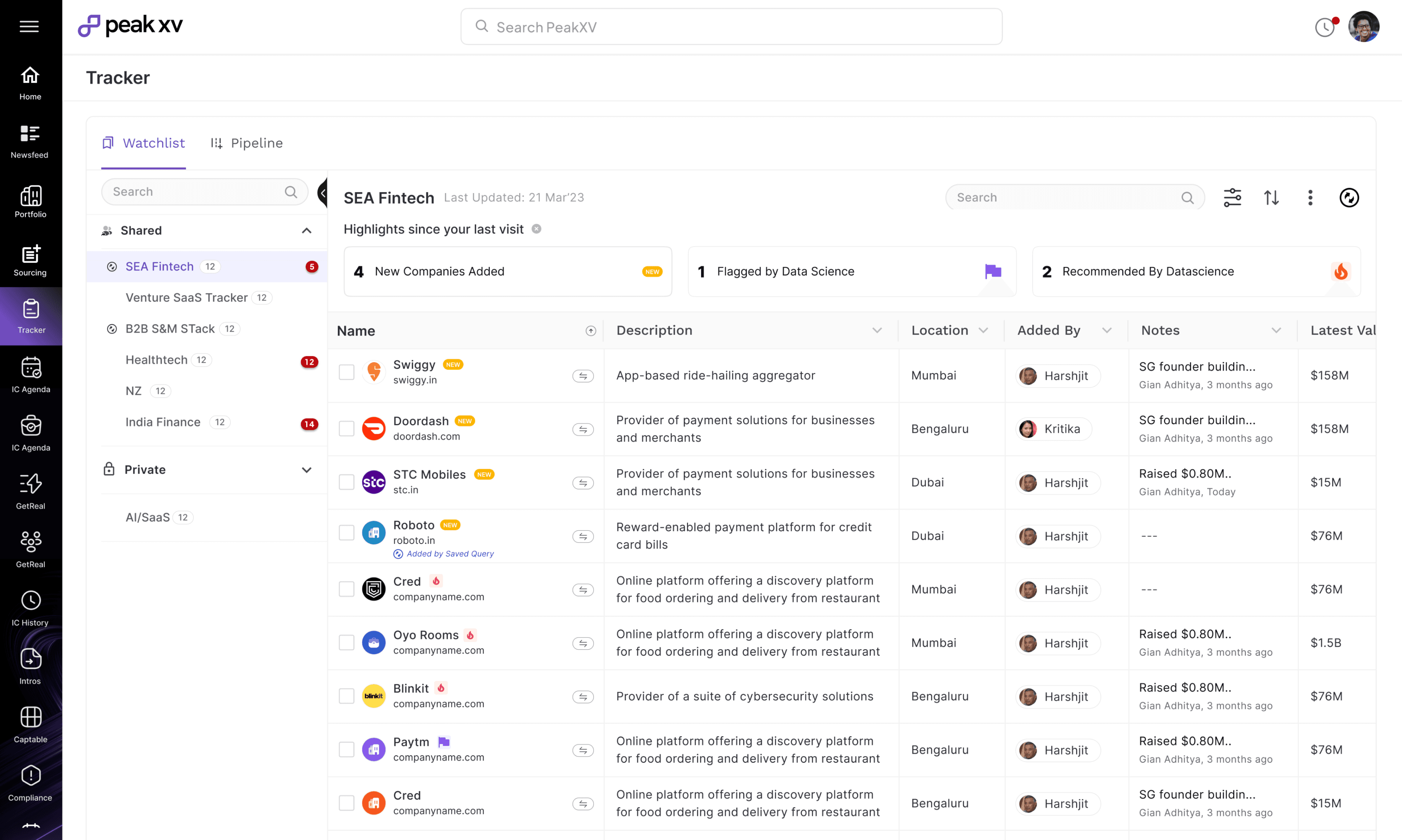
Track
Add companies for due dilligence in your private or team Watchlists, share it among your team members, add Notes, set up automated queries etc.
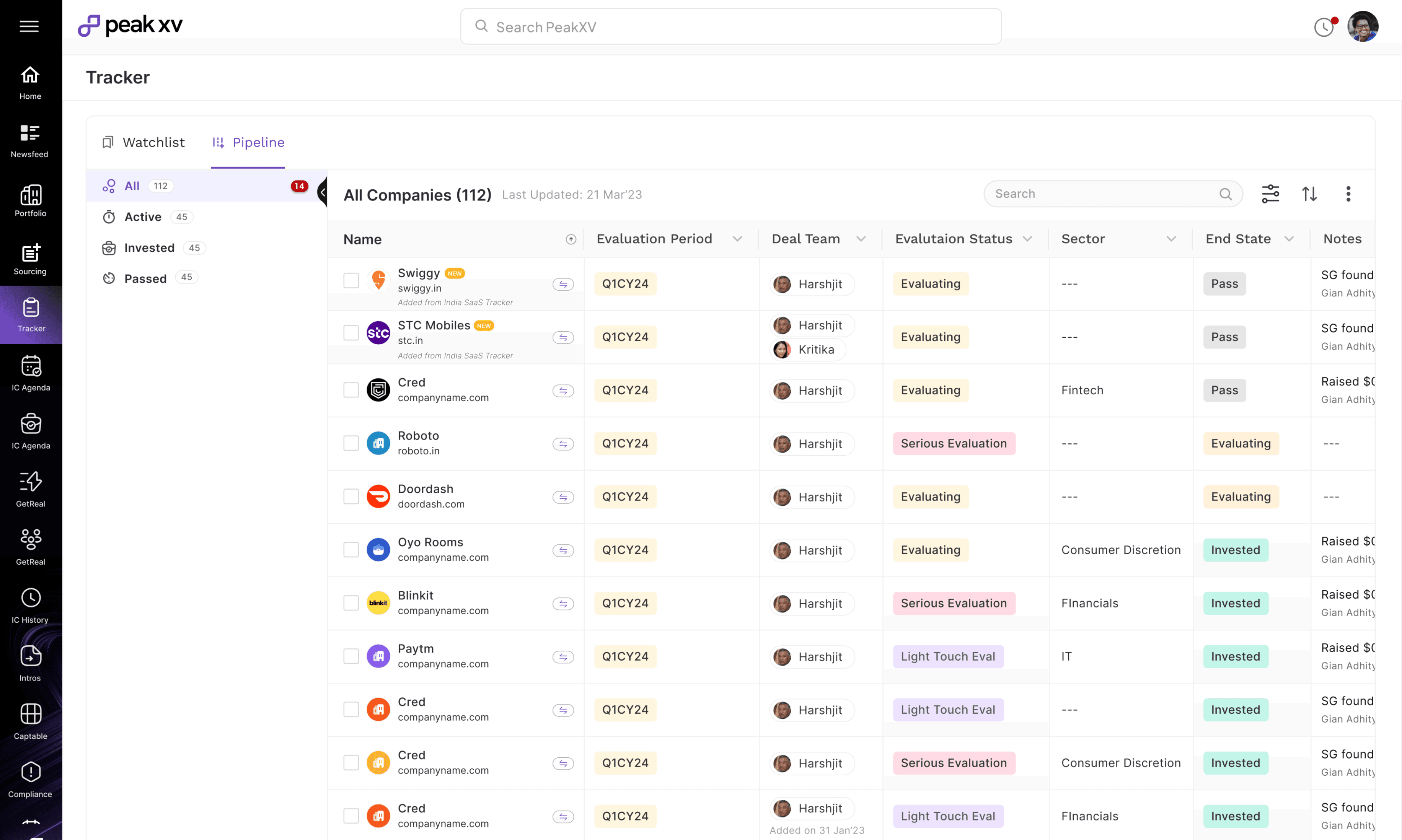
3
Add to Pipeline
Add companies that you or your team likes into the investment deal flow for further analysis and decison making
Snapshots of all the features that were designed during the lifecycle of this requirement
The end to end Investment Process
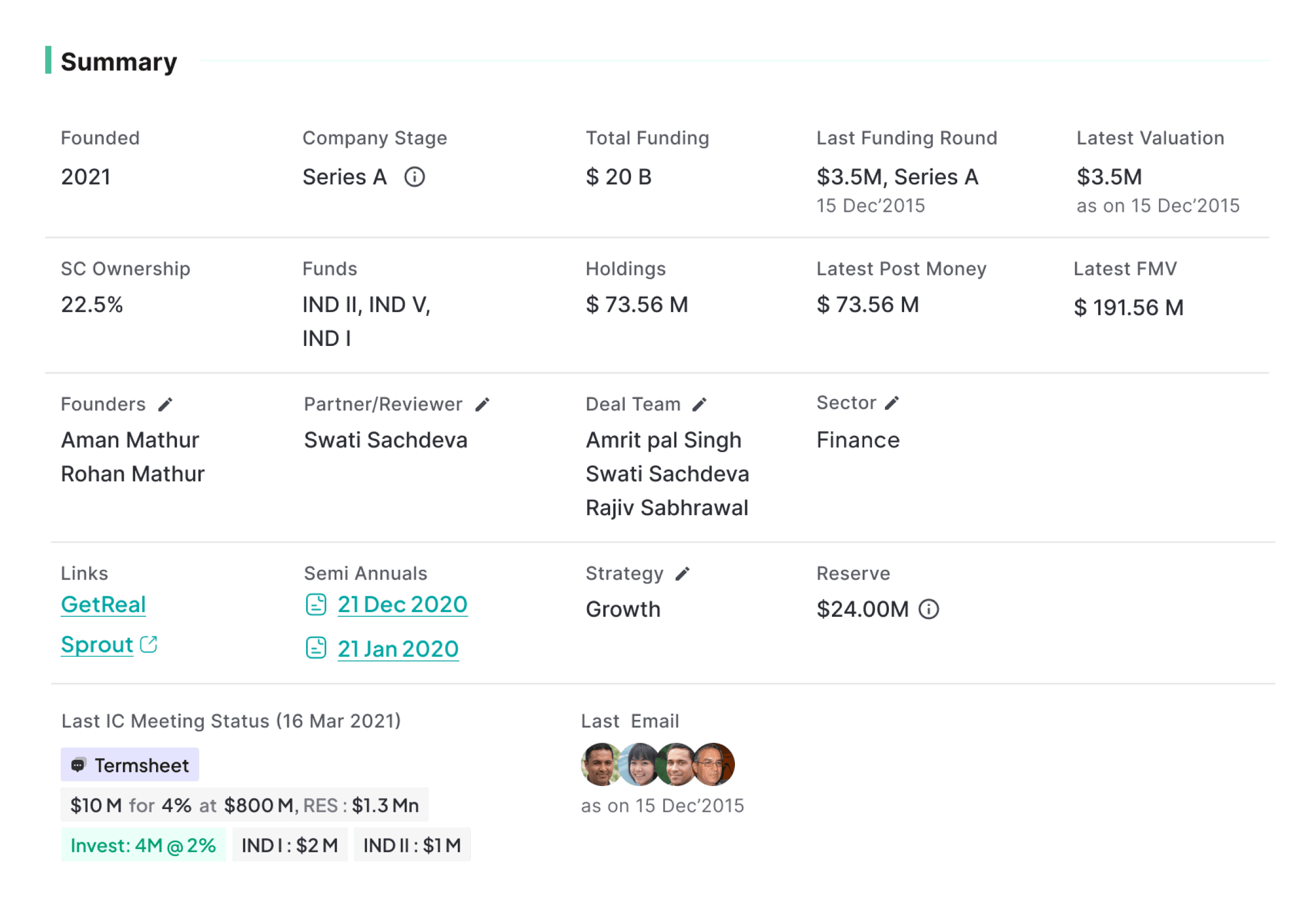
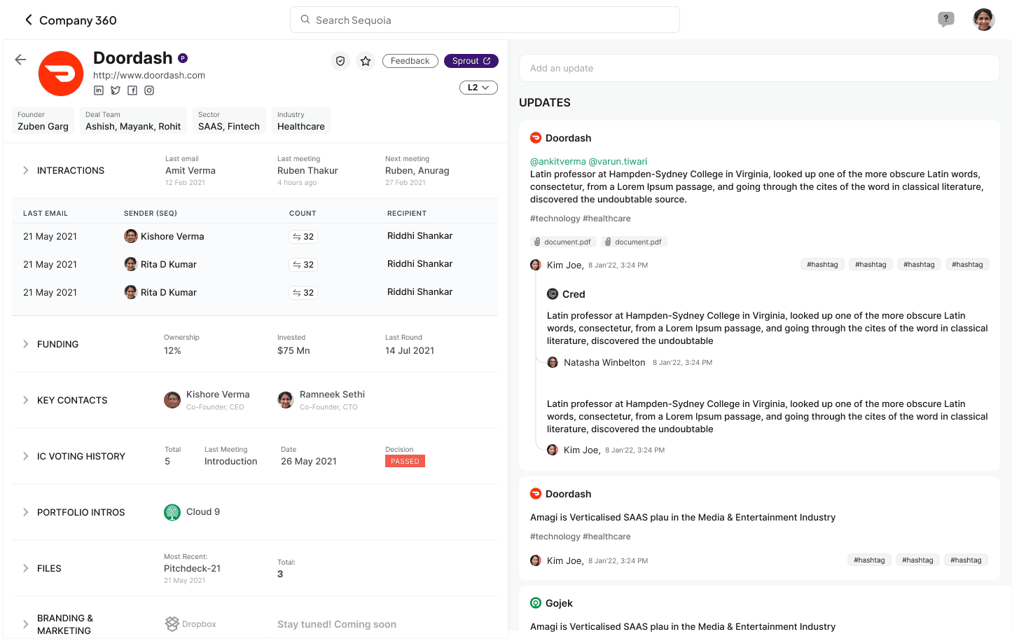
View Details- Company 360
Company 360 is one of the key features designed during the process. It allows investing partners and analysts at Peak XV to study upcoming startups & existing portfolio companies, facilitating better fund allocation and decisions. The designs employ simple data visualization and structured data organisation which helps users in better assessment
A rubrik based design language which is easy to read, analyze and also flexible enough to accommodate new data integration requests without having to be dependent on designers or digital transformations. A data friendly timeless design framework
Summary - Fluid Grid based Data structuring
Scenario
Users want a summarized view of a company's key metrics that is simple, easy to consume, and flexible enough for future data integrations
Solution
Fluid Grid Based data organisation systemm to help the product scale seamlessly. This enables the UI to adapt and grow to varying amounts of content without manual adjustments or doing complete transformations
Easily Add Updates, Read Recent Notes
User Scenario
Users need to add and consume updates about the companies so that relevant stakeholders can stay informed about the latest developments.
Solution
We integrated the Newsfeed feature by dividing the screen in a 60:40 ratio. Users can adjust the width using a resize toggle.
Additionally, a filter feature allows users to easily access historical data

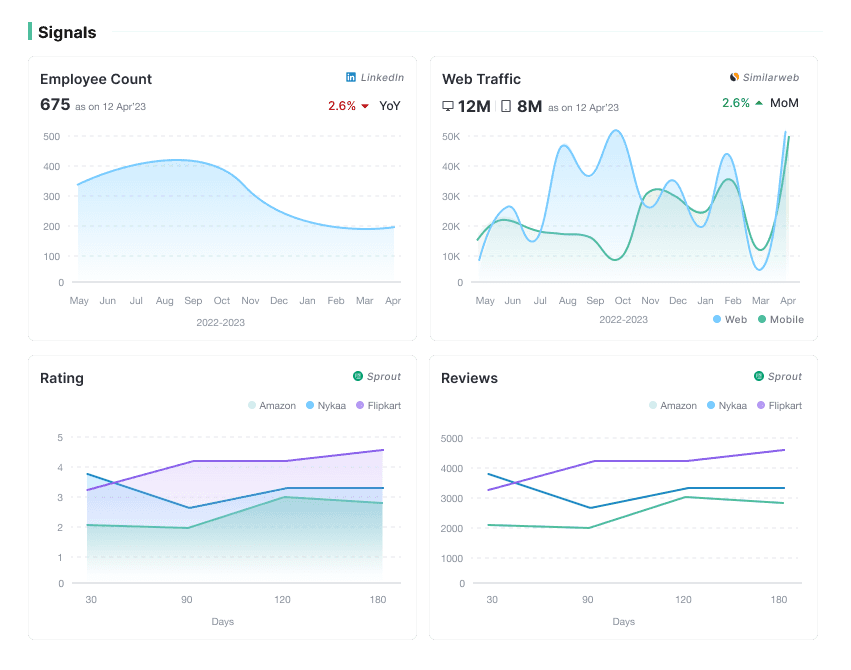
Fig:3 Signals
Graphical Data Visualisation
Simple graphical representation of data with sources for easy consumption

Tabular organisation
Layered presentation of Funding information with added filters giving easy options to the users to analyze
Fig:4 Funding Details
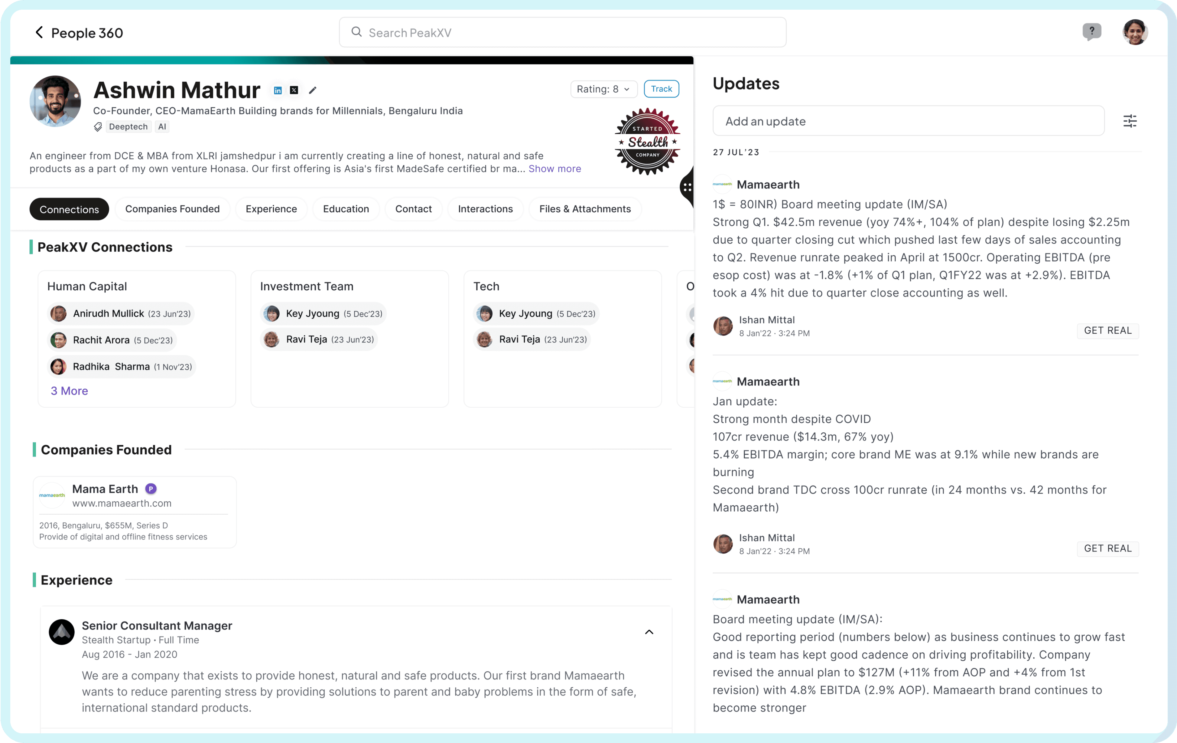
Designing with a Systems Approach
This was designed by factoring in other use-cases and by using a systems design approach. By engaging into complex dialogues and conversations with various stakeholders, We designed this dynamic 360 page that can easily accommodate other detail pages like People 360 or company 360.
We used a rubric based design principle which helps in easy integration of upcoming features
Process
Understanding the core problem
I kicked off the project with a comprehensive analysis of the current process. I individually spoke with around 10 users to assess their daily activities and how they scout and analyze companies. I aimed to understand the challenges they face, the metrics they need, and how we can add value to their daily processes through an interface other detail pages like People 360 or company 360.
Our Users

Investor Analysts
Analysts focus on evaluating and analyzing investment opportunities, conducting due diligence, and supporting the investment team

Investor Partners
Investors hold more senior positions, overseeing the investment process, making strategic decisions, and managing the team's investment portfolio.
“When we scout any company or a stealth founder we are unaware if any other member from Peak has done any work on them”
-Principal Analyst
“You see, there’s a lot of manual work that we have to do. From jumping multiple third party apps, to cleaning and adding right data”
Junior Analyst
“Sometimes, for our portfolio companies a lot of the data exists in our internal tool and excels. While seeing 3rd party apps, we don’t get that contextual data differentiating between a portfolio company and a new company”
Junior Analyst
“We can’t track externally what all our teams are working on individually unless we get on their excels separately”
Investor Partner
Tools Used By our Users
//
The interviews helped to map the essential third party tools that our users work on. It also helped me to identify the essential tasks that they perform on a daily basis.
For Data Analysis & Insight Gathering
For documentation & Data Sharing


Challenges
No Cohesion between Organisation & External Data
Users want a straightforward platform that organizes data in a clear and concise manner, making it easy to understand and share with their team members.
Duplicate Efforts
Users in different teams often find themselves performing duplicate efforts due to un co-ordinated efforts
Multiple Team & Private Excels
Users mainly use excels and spreadsheets to record information and frequently edit values in the tables to compare information
Inconsistent Data
The platforms users accessed had inconsistent data which leads to ambiguity and needed inputs from data science team to review
Manual Work
Due to the need to access multiple tools for sourcing, analysis, and adding a company to the deal pipeline, users face a significant amount of manual work, which reduces their efficiency
Inconsistent Data
The platforms users accessed had inconsistent data which leads to ambiguity and needed inputs from data science team to review
Understanding the Current Process
I mappped down the current process and divided them into three phases so that we can deliver the solution in an efficient manner. This was done after evaluating the available resources, tech architectures by focusiing on creating maximum impact with the least available resources

Phase 1
Phase 2
Phase 3
UX Challenges
Integrate News feed
Integrate an existing feature to create a cohesive experience
2
Limited Time
The design had to be finished within 6-8 weeks
3
Needs to be Highly Scalable
The design had to accomodate new features and functionalities

Quick Filters
Option to add new Notes
Notes and updates added by different users
The existing newsfeed with features to be integrated
One of the signals we had received from the leadership, which also echoed during the workshops is the need to integrate the feature along with the company profile so that the users can seamlessly analyse companies with ease. These notes include updates like financial health, new discoveries, Meetings etc.
Contextual Analysis & Benchmarking

What our users use
What is the sequence of steps a user has to follow during company analysis?
How is the data organised in these applications?
How easily can we integrate the data from all the 4 platforms to reduce duplicity
Which features are most used and needs to be shipped first?

Ideas that didn’t make it
We tested multiple variations of the MVP with users and stakeholders using a user-centered design approach, which helped us move quickly with context.
One successful aspect was visually presenting the designs to explore users' diverse perspectives and reactions. This process provided a deeper understanding of the stakeholders and informed the evolution of our MVP. It also encouraged us to think beyond a single design, adopting a holistic systems thinking approach.
UX Problems
Lacked option to filter the updates section
Users need to click through all accordions to learn more about a certain metric
The summary for each section was not flexible to accomodate new integrations
Visual Problems
The summary lacked visual appeal because the content was not uniform.
The layout displayed an overwhelming amount of information
Next Steps & Learnings
Next Steps
After successful launch of the product I designed the IOS Version of the product
Design documentation & testing
I worked on researching & designing the phase 1 and phase 2 of the product which included tracking a company & adding a company to a Investment committee
Learnings
Working with Peak XV was one of the significant experiences in my career. It pushed me to learn the intricacies of the startup ecosystem and also enabled me with all the information about how a Venture Capital System works. It also exposed me to learn how selective user feedback lead to solutions that don't meet the needs of the broader user population.
Trying to accommodate every user request, even contradictory ones, can make the product unfocused and difficult to use